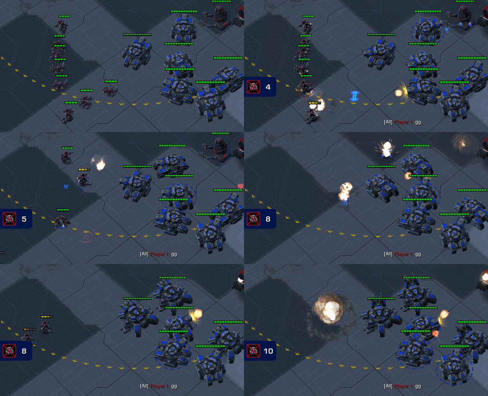
SC2 Notifications GIF extravaganza
Much has happened since we demoed the “Workers Killed” notification panel for StarCraft 2! Thanks to the combined efforts of GameHeart and DreamHack, this past month has been the fastest turnaround from unveiling to production code on our MIT Overseer research project to date. Thanks to everybody who helped us test the code, find bugs, and especially to MiTNicketh (Nick Mohr) for implementing the feature in the first place!
We’re not done yet, and we do need more help with testing and feedback. If you’re in a hurry, this is all you need to know:
- Start up StarCraft 2 and invite a friend (or three) to a party
- Click on “Custom Maps”
- Select any 1v1 or 2v2 melee map
- Click on “Create Map with Mod.”
- Search for and select “GHMITTest”
- Play a 1v1, 2v2 or FFA melee game
- Watch the replay
- Let us know if you see any bugs!
With that, here are the changes we are testing:
Dropship Alerts on the Minimap
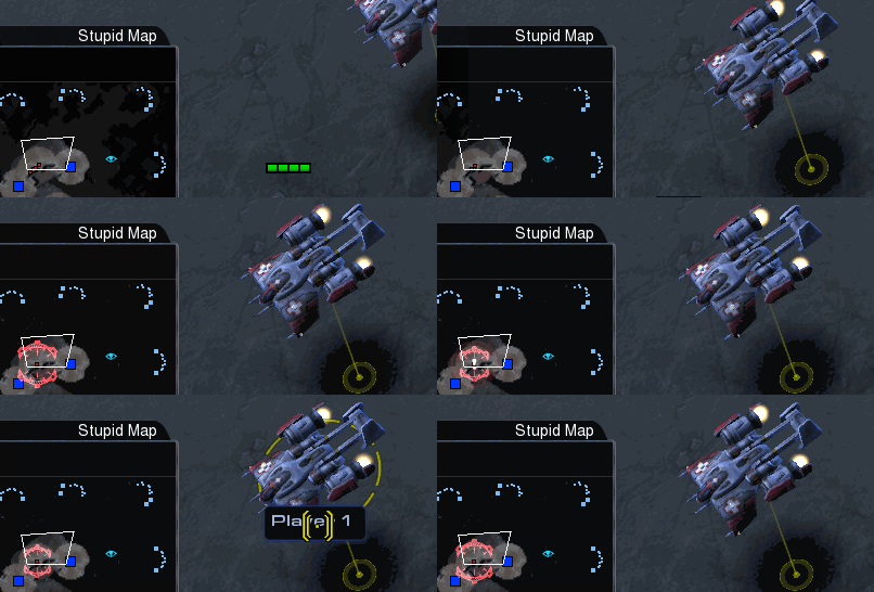 If a dropship (warp prism, overlord or medivac) picks up a full complement of healthy troops, observers will see a ping and exclamation mark on the minimap that tracks the dropship for five seconds, alerting viewers to incoming drop shenanigans!
Orbital Scans on the Minimap
StarCraft 2 Proleague introduced their own version of Upgrade Notifications, as well as a really nice minimap representation of orbital scans. It’s a great idea, so we’re trying that out with GameHeart, with a smaller ping and a little more transparency to the animation.
More colors for Workers Killed Notifications
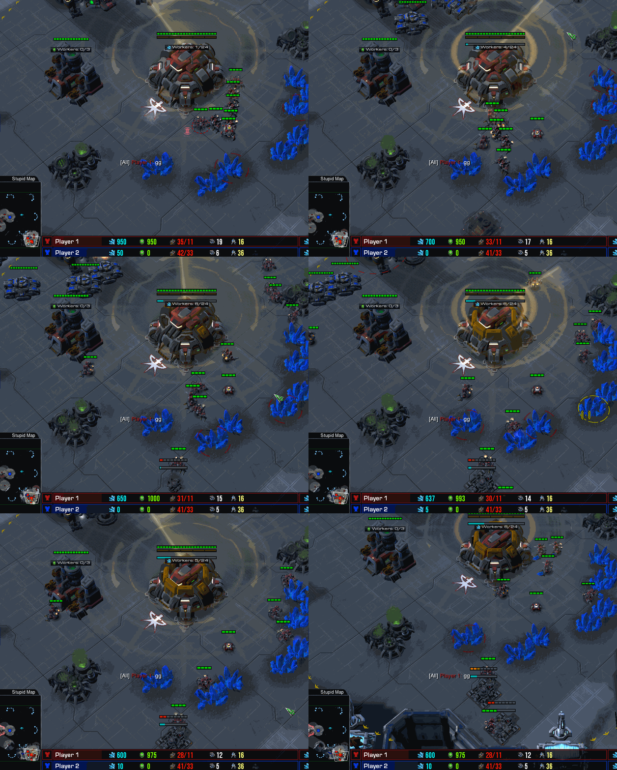
The Workers Killed Notifications got a lot of testing in DreamHack. We noticed that observers (such as the talented FunKa) still continued to open the 1v1 Workers Killed panel at the end of skirmishes, which displays worker deaths in the colors of the aggressor. Prior to DreamHack, we knew that our notifications, which highlight the color of the player hurt by the attack, might clash with “more color = more advantage” design principle behind Blizzard’s standard interface.
We didn’t notice anyone seeming too upset by the clashing colors, but we certainly felt a little uncomfortable every time the 1v1 panel appeared on the stream. To address that, we have tinted the background in the color of the aggressor and made it slightly darker and translucent. We hope this still makes it completely clear which player’s base is being attacked during worker harass, while establishing a visual connection to the attacker’s colors in the 1v1 panel.
Our system can handle up to 4 panels, one for each player who could take damage in a 2v2 or 4-player free-for-all game. This means that if two players attack the same mineral line at once, the background color of a single panel may alternate between two colors. If one player attacks two opponents at once, you would see the same background color for two separate panels. We think the transparency will reduce the cognitive dissonance, but this is certainly a place where more feedback would help us tremendously.
The panels now automatically disappear 15 game seconds after the last worker death instead of the 20 seconds shown in DreamHack. And if you hate the Workers Killed Notifications, you can always hide them as an observer using Control-Shift-W. Even in replays!
Tweaks to Upgrade Notifications
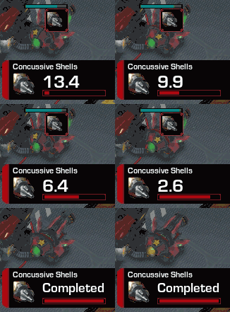 Finally, we’ve made a few changes to Upgrade Notifications, which only appear in 1v1 games.
The countdown is now one decimal place and we’ve adjusted the fonts a little. It means it takes slightly less computation (our code runs once every 0.1 seconds instead of 0.01 seconds) and we fixed an elusive display bug in the process. As seen in Proleague and DreamHack, new notifications now push old notifications upwards instead of stacking above existing panels, so there’s less “bouncing” up and down as multiple upgrades complete.
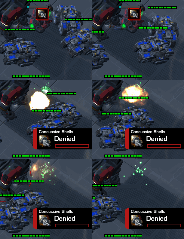 We’ve also gotten a good response to the “Denied” notification when a research building is destroyed while an upgrade is in process. Previously, “Denied” would show up only in the last 15 seconds of research completion. Now they’ll appear whenever an upgrade is destroyed.
What’s Next?
We’re planning to provide details on how Custom UI creators can customize the look of the Upgrade and Workers Killed Notifications, so if you really like the gradients of Proleague or the brushed metal aesthetic from Blizzard, or just want to reposition them on your observer screen, we’ll have more news for you soon.
